Viewers decide in under a second whether to click your video. Visual hierarchy is what makes that decision easy. It guides the eye to the most important element first, so your thumbnail communicates instantly. You don't need Photoshop or a design degree. You need a clear focal point and a simple layout order. This guide explains the core principles and shows you how to apply them step by step.
What Is Visual Hierarchy in Thumbnails?
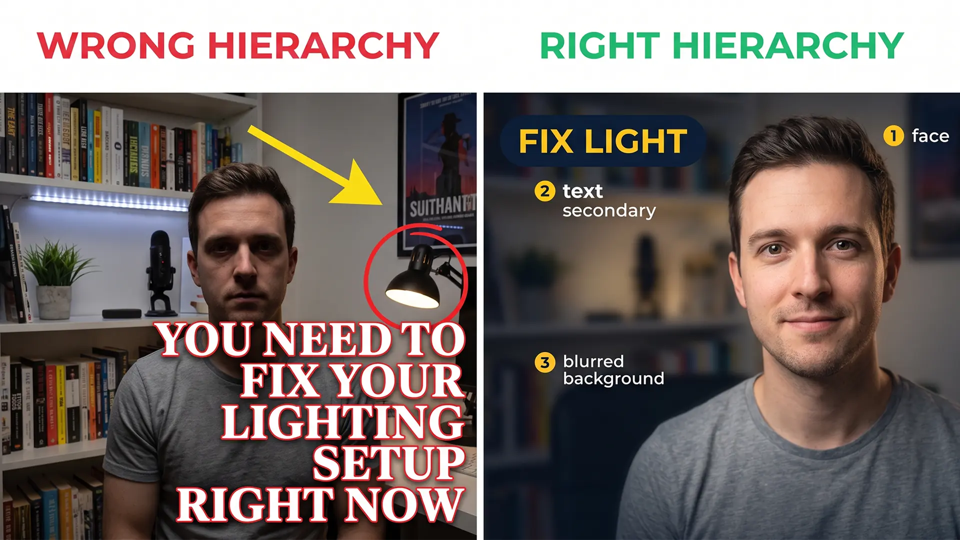
Visual hierarchy is the order in which the eye processes elements in a design. In a thumbnail, that order is usually face first, text second, background last. When you establish a clear hierarchy, you tell the viewer where to look and what matters. Without it, the eye wanders, and the thumbnail gets skipped. A single clear focal point beats a cluttered design every time. This is the foundation of thumbnail CTR.

The 4 Core Principles of Thumbnail Hierarchy
Use these four levers together. One alone rarely fixes a flat thumbnail; stacked correctly, they tell the eye exactly where to land.
| Principle | What it does | Quick fix |
|---|---|---|
| Size and scale | Largest element wins attention first | Crop so the face or subject is clearly the biggest element in frame |
| Contrast and color | Separates subject from background | Bump contrast; use one accent color opposite your background on the color wheel |
| Positioning | Guides the eye to the focal point | Place the hero on a rule-of-thirds intersection; keep the bottom-right clear (duration badge) |
| Negative space | Frames the subject and reduces clutter | Blur the background or add empty margin around text |
1. Size and Scale
The largest element wins attention. Make your face or main subject the biggest thing in the frame. If text is larger than your face, the viewer reads the text first, which may not be what you want. Scale creates a natural order.
2. Contrast and Color
High contrast is what makes an element stick out first. Black and white is the extreme, but complementary colors work too. Pick your background color, then use the opposite on the color wheel for text or accents. Many top creators also limit palettes to about three colors so one accent can pop. Dark backgrounds make subjects pop. Use contrast to separate the focal point from the background. For example, a yellow arrow on a dark blue background draws attention immediately. Avoid using multiple bright colors that compete.
3. Positioning (Rule of Thirds)
Place your focal point at the intersection of the rule-of-thirds grid lines. This off-center placement feels natural and guides the eye. If you add text, Western viewers read left to right, so putting keywords on the left is often the safest default. YouTube's interface also covers the bottom-right corner with the video duration, so keep important elements away from that area.
4. Negative Space
Empty areas give the eye a rest and frame the subject. Don't fill every pixel. A clean background makes your face or text stand out. Negative space also makes the thumbnail look professional and less chaotic.
Face First, Text Second, Background Last
Stack your thumbnail in this order. When every layer has a job, the viewer reads the image in under a second.
| Layer | Priority | Size guide | Example |
|---|---|---|---|
| Face / subject / demo | 1 (primary) | Largest, clearest element in frame | Expressive face, product hero, or staged demo |
| Text overlay | 2 (secondary) | ≤ 4 words; smaller than the hero | Bold "REAL RESULTS" on the left |
| Background | 3 (support) | Lowest contrast; no competing detail | Blurred office or solid gradient |
Human brains prioritize faces. YouTube's own guidance notes that expressive faces tend to perform well. But the hero can also be a product, result, or demonstration if that is what the viewer cares about. Use your face when you are the brand; use the object when the promise is the thing itself. If you add text, keep it to four words or fewer. Make it readable at small sizes, and place it second in hierarchy, meaning it should be smaller than the hero and never cover it. The background should only support the subject, not distract. For example, a blurred background or a simple gradient works well.
How to Apply Visual Hierarchy
You can apply these principles in any image editor or design tool. Here's a step-by-step workflow:
- Take or import a dedicated thumbnail photo, not a random video still. A posed shot gives you control over expression, lighting, and framing; stills often catch weird mid-word faces.
- Crop to 1280×720 (YouTube's recommended thumbnail size). Frame your hero on a rule-of-thirds intersection.
- Adjust contrast and brightness to make your subject pop. Increase contrast slightly to separate the hero from the background.
- Add text overlay only if needed. Keep it to four words or fewer, use a bold sans-serif font, and place it on the left so it does not cover the hero.
- Export the final image (under 2 MB) in JPG or PNG.
Iterate quickly between versions. That speed matters when you A/B test thumbnails.
Common Thumbnail Hierarchy Mistakes
Avoid these pitfalls:
- Too many elements: If the viewer doesn't know where to look, they won't click. Limit to one focal point, one text block, and a simple background.
- Text covering the hero: Your face, the product, or the result should never be hidden behind text or clutter.
- Text competing with the face: If both are large and bright, the eye is confused. Make one clearly dominant.
- Busy backgrounds: A detailed background swallows the subject. Use negative space or blur to keep focus.
Quick Checklist Before You Export
Before you upload, run through this checklist:
- One clear focal point (face, product, or demo)
- Text is 4 words or fewer and readable at small size
- Hero is not covered by text or clutter
- Background supports the subject, not distracts
- File is under 2 MB and 1280×720
If every box is checked, your thumbnail is ready.
Final Thoughts
Visual hierarchy is a skill, not a talent. Practice it on every thumbnail you make. Stack your layers in order, test at small size, and cut anything that competes for attention.
Start applying these principles on your next upload. Your CTR will thank you.
GrepCut
Author of this article